Getting Started With Flixier Pro Beta 1
Updated on June 1, 2025

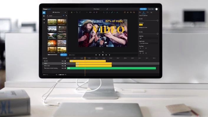
We are very excited that you decided to try Flixier, for a smooth dive into the product we prepared a list of features supported as of now. We urge you to test them and hit us back with feedback, we are looking forward to things that you would like adjusted and to new features that you would like to see added to the product. We also prepared a development road-map that we will make public soon, now it's your chance to influence that the most.
1. Libraries
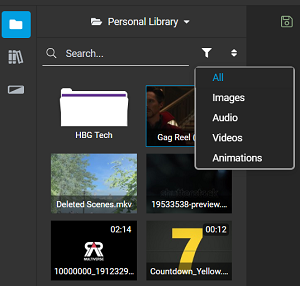
As soon as you create a new project you will be greeted with the video editing interface, starting on the left side of the screen you will find the "Libraries" panel. This section is made up of several tabs, for the beta phase here you will be able to access your personal Library and a number of transitions. This is also the place you will find the import button that allows you to add more media. You can import files from your personal computer, Dropbox, Google Drive and One Drive.

2. Timeline
The timeline is perhaps one of the most feature rich aspects of Flixier, here you will manage how media is shown in the project. You can group elements for easier handling, rename, hide, lock or remove them. To cut the length of a video or any other media file you can hover at one of its ends in the timeline and drag it.

Transitions can be added to a video or image by dragging one from the Transition Library over the media file in the timeline. You lengthen or shorten the transition time similarly to cutting a video, hover at it's end and drag it to make it shorter or longer.
3. Properties panel
On the right side of the screen you will find the properties panel. This section again holds a number of different tabs that allow you check or change information about different objects.

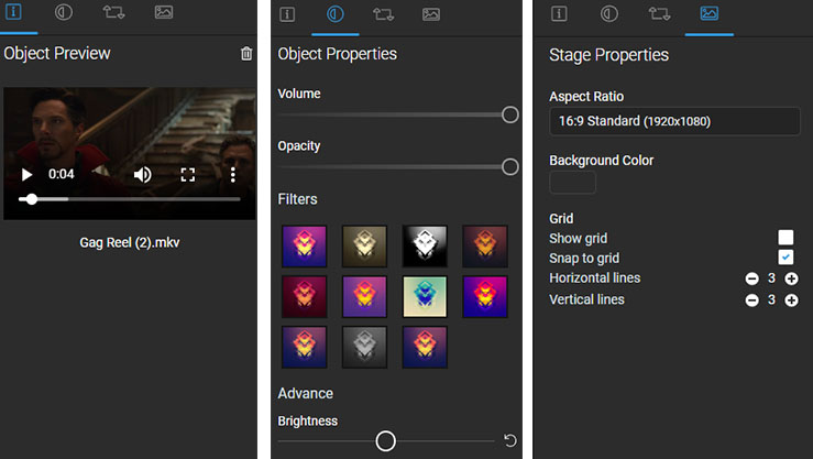
The first tab is the "Information Panel" which displays relevant information about media files when you click one in the Library panel, here you can also preview a video or a sound.
Moving on there is the "Object Properties" tab which shows you relevant properties that can be changed for objects in the timeline. As an example here you can add filters to videos and change fonts for text.
The last tab in the beta is the "Stage Properties", here you can change properties like the aspect ratio of your project, background color, enabling grid lines and snapping to grid. All of them directly adjusting your stage.
4. Toolbar
The toolbar sits at the top center of the interface and offers key functionality. Here you can save the project, undo or redo changes, zoom in/out of the stage and pan around it. Even more this is also the place where you can add text into the project and send items backwards or forwards to change which ones are displayed first.

At the top of the toolbar you also have the option to rename your project and by clicking on the "Flixier Pro" logo you can go back to your dashboard.
5. Stage
The stage is the central element of any video editing tool. In Flixier it allows you to move things around and resize them. Right clicking on elements also allows you to change their display order, rotate and flip them around.

6. Others
As you might know by now in Flixier you can export any video in under 1 minute. For the beta we will keep the speed at 2-3 minutes with an update coming soon that will enable under 1 minute rendering, to read more on how to render go here. You probably also know that we have a very smooth draft review system and sign-off, to learn more about it go here.
That's about it for now, this is a high level presentation of the Flixier interface, we are confident that from this point you will figure out the details by yourselves. Still we are here to be proven wrong at every step so we welcome you to challenge us through feedback and feature requests. I hope to hear back from you soon!
Editors, strategists, technology experts, and content creators sharing their thoughts on creating engaging video content. Fast and easy.


